INTRODUCTION
Welcome to my blog. This is a post I’ve been wanting to write for a long, long time. I’ve always had difficulty writing, especially when it comes to the subject of HDRIs, as it is both technical and artistic. I’ve written about this subject so many times but never hit Publish. I’ve come to understand that it’s not for me to try and lecture the reader on photography, colors and computer science. Instead, I’ll try and explain a few simple, but very important, aspects of HDRI creation in the hopes that we’ll continue the discourse agreeing on the key principles laid out in this post.
I’ll be going through the following:
Keep in mind that I expect my readers to have a basic understanding of photographic terms like stops, bracketing, and clipping. I will stop and explain here and there, but please check out my links at the end if you feel like reading up on these subjects a bit more.
Okay, let’s get to it and start with the most important one, dynamic range:
Part 1: Dynamic Range
The number one thing to get right in an HDRI is the dynamic range. This might seem like an obvious statement, but you'd be surprised how often the importance of full dynamic range is ignored, both in the HDRIs you can get online, but also in the VFX industry. I don’t want to be overly critical here, so I’ll try and explain what I mean.
It is my belief that many HDRI photographers shoot too few exposures, either because they don't pay attention to clipping, or perhaps the scene they’re in changes too quickly, making it difficult to spend too much time on one HDRI. On a movie set, there's only so much time a VFX supervisor or on-set data wrangler can spend shooting HDRIs before the light crew starts disassembling the set. It's actually common to shoot no more than 7 exposures and move on (Weta Digital has recently started shooting 14 exposures instead of 7, in their so-called “Extended HDRIs”). Too few exposures can result in clipped shadows and highlights in the HDRI, which means you're not capturing the entire dynamic range of the scene. If, however, you bracket the same amount of exposures far enough apart that you do cover the entire range (like +-3EVs), you can end up lacking the important overlapping data between exposures and that can make it really difficult to get a smooth and accurate interpolation between the exposures. More exposures mean better data, but that doesn't mean you have to shoot +-1/3EV either. Generally, +-1EV is good enough to ensure accurate coverage, in most situations. But, this means 7 exposures are insufficient to get the full dynamic range and therefore adding more exposures is necessary.
1 EV (exposure value) = 1 stop of light
I usually shoot 18 or 23 exposures per angle, depending on the scene. My camera just happens to have bracket modes of 3, 5 and 9 exposures, so I can quickly shoot 2x9 brackets and add another 5 at the end, should the scene need it (dark, high contrast environments). The resulting HDRI goes from complete black to complete white in 99% of the cases, having gone from 1/8000s to 30s exposure. In outdoor scenes, I mostly stick to 9+9 brackets, since this covers completely underexposed (all black) to completely overexposed (all white). Now, let’s say I add the extra bracket of 5 at the end, how many stops of dynamic range is shot with 23 exposures at +-1EV? My camera sensor shoots just under 15 stops of dynamic range per exposure. Combining the dynamic range of 23 exposures adds to way over 30 stops of dynamic range per HDRI. I’ve made a simple chart plotting these two bracketing methods, based on the dynamic range on my camera’s sensor:
Sony A7RIII = 14,7 EVs (RAW)
But there’s a problem! Most professional cameras can’t shoot any faster than 1/8000s, resulting in clipped pixel values in very bright areas like the sun. Important luminance data is therefore lost:
In this case, it doesn’t matter how many EV’s this camera can acquire, the most important information still isn’t captured. We need a way to capture even brighter values than what a 1/8000s exposure and small aperture like f/32 can provide. The recommended tool for this job is an ND filter (non-diffusion dark glass in front of the lens) that can darken the image enough to avoid the bright spot clipping. I'm using a high-quality 10-stop ND filter that gives, you guessed it, 10 more stops of dynamic range.
Let’s plot these extra stops onto the same chart as before. The yellow line represents the highest possible amount of EV’s I can get with the ND filter (without exceeding the cameras 30s bracket maximum):
Note: I’ve never needed over 40 EVs of dynamic range in any of my HDRIs. For high contrast situations, like direct sunlight, I only need the first 9+9 exposures plus the additional 9 for the sun. This more than covers the entire dynamic range of the scene and the final HDRI ends up between 20-30 EVs.
In this section I've described what is essentially a Full Dynamic Range Image (FDRI), meaning it has no clipped value pixels and therefore the entire dynamic range is captured. The term HDRI has been a common phrase in the VFX community for almost 20 years, but the term has always been extremely vague, where "high" could mean anything. That's why HDR photographers make sure to add "unclipped" to their descriptions, letting you know they've captured the entire dynamic range of the scene.
But in most cases, this just isn't true.
Most HDRI photographers I've checked out, offering both free and commercial products, instead decides to side-step the issue of highlight clipping by just “painting” in the missing values with a high-intensity brush or copy-paste the sun from a rendered daylight system. This is way easier to do than go get a pricey ND-filter and do the extra step of shooting the needed stops and seamlessly stitch the whole panorama together. This means we're left with an approximation of the real dynamic range of the scene, based on what looked good enough in the resulting renders.
This, however, is not an unclipped HDRI, or FDRI.
There's no shame in doing this. I've done this many times myself when I haven’t been able to capture the real sun. In lookdev work, who cares if the sun isn't the real sun? So what if the intensity is off by half a stop or so? Well, in the end, that's up to the lighting artist to decide. But using the phrase "unclipped" should in my opinion only be used when the actual full dynamic range of the scene is captured.
I hope to show with this blog post that more goes into creating high-quality HDRIs and why my work is a huge step up compared to your usual HDRIs. With dynamic range taken care of, let’s continue on with the next aspect, Color.
Part 2: Color Calibration
One of the most recognizable mistakes in HDRIs, apart from highlight clipping and compensating by putting a fake sun in, is the color calibration. This, at first glance, is due to incorrect white balance and is by far the easiest mistake to fix. If there’s no other reference available, just render a grey sphere while adjusting white balance!
But, a deeper issue with a lot of HDRIs is that even after fixing white balance, something isn’t quite right. Common colors seem really inconsistent between HDRIs, based on what kind of equipment the photographer’s using and the light sources in the scene. I struggled with this for many years and I ended up getting pretty good at manually adjusting my HDRIs to correct for this.
I began taking this issue seriously and invested in a pocket-sized color chart, a handy tool no photographer should be without. This chart is, in essence, a reliable way to correct any kind of color inaccuracy in your camera (and through the lens/filters). Color shift and contrast can easily be corrected by automated analysis and this was a turning point for me, as that meant I could spend more time on my photography, knowing that colors would be handled correctly when putting the HDRIs together. No more spending countless hours adjusting individual color channels in post to match real-world references.
Let’s take a look at how one color chart can look through one camera, using three different lens setups. Move the blue slider to see before and after the RAW photos have been color corrected:
Analysis-assisted color correction, as you can see, fixes any color shifts and inaccuracies when developing the RAW photos. This results in a visually consistent basis for building the final HDRIs, with no post-corrections needed. Let’s put this to the test:
This reference was corrected using the chart. Using the HDRI to light a 3D scene with the same kind of color chart texture, we can see how well the render matches the reference after everything is correctly calibrated. This is important in still rendering, but even more crucial when it comes to consistency between HDRIs. This video shows how many different HDRIs holds up when calibrated correctly:
What does this mean for the user? Ask any lighting artist who’s used to sourcing their HDRIs from all over the internet. Their shaders and colors tend to act very differently with different HDRIs and this means either adjusting their shaders to fit each HDRI or adjust their renders in post to correct for the inaccuracies between the HDRIs. This color correction method, however, ensures a true to life color rendition and no work has to be done to “fix” the HDRI. There’s another benefit of getting accurate colors between the HDRIs, in that it also provides a 1-to-1 match between an HDRI and its HDR backplates, no matter the render engine.
But after I started familiarizing myself with other color spaces, like ACEScg, plus the fact I began shooting log video using Sony’s S-Log 2/S-Gamut, I’ve come to realize different color spaces have different effects on my HDRIs. So I set out to find the color space that best suited my particular camera setup.
I want to start by showing how the regular color checker looks when shot using my camera’s native S-Log2/S-Gamut color space:
All test footage in this section was converted to ACEScg in NUKE and analyzed through a heavily modded version of this script. The circles inside the color patches are the ideal color, sourced from Colour-Nuke (github). Not all patches looks correct in one particular frame, but rotating the color chart shows that color consistency is pretty much spot on.
On the left side of the video, you’ll see all the pixels in the footage plotted on the CIE 1931 Chromaticity diagram. The color checker has fairly muted colors, representing natural, real-life colors typically encountered in photography. But even though the color patches stays relatively close to the white point (in this case D65, or 6500 Kelvin), some colors quickly fall outside the smallest gamut, sRGB. This is why sRGB is not recommended for photography, since even common colors will clip . The second smallest, AdobeRGB, is wide enough to fix this. S-Gamut, used in this example, has a very wide gamut and I would have a hard time finding any colors in real-life that would exceed its boundaries.
Remember, this footage wasn’t shot in RAW, so the sensor data was debayered in-camera using that particular color space. So now I want to show the same test using RAW photography, merged into HDRIs. This next series of renders show a set of RAWs from my camera developed using different color spaces, merged to HDR and then analyzed in NUKE (using the ACEScg working space).


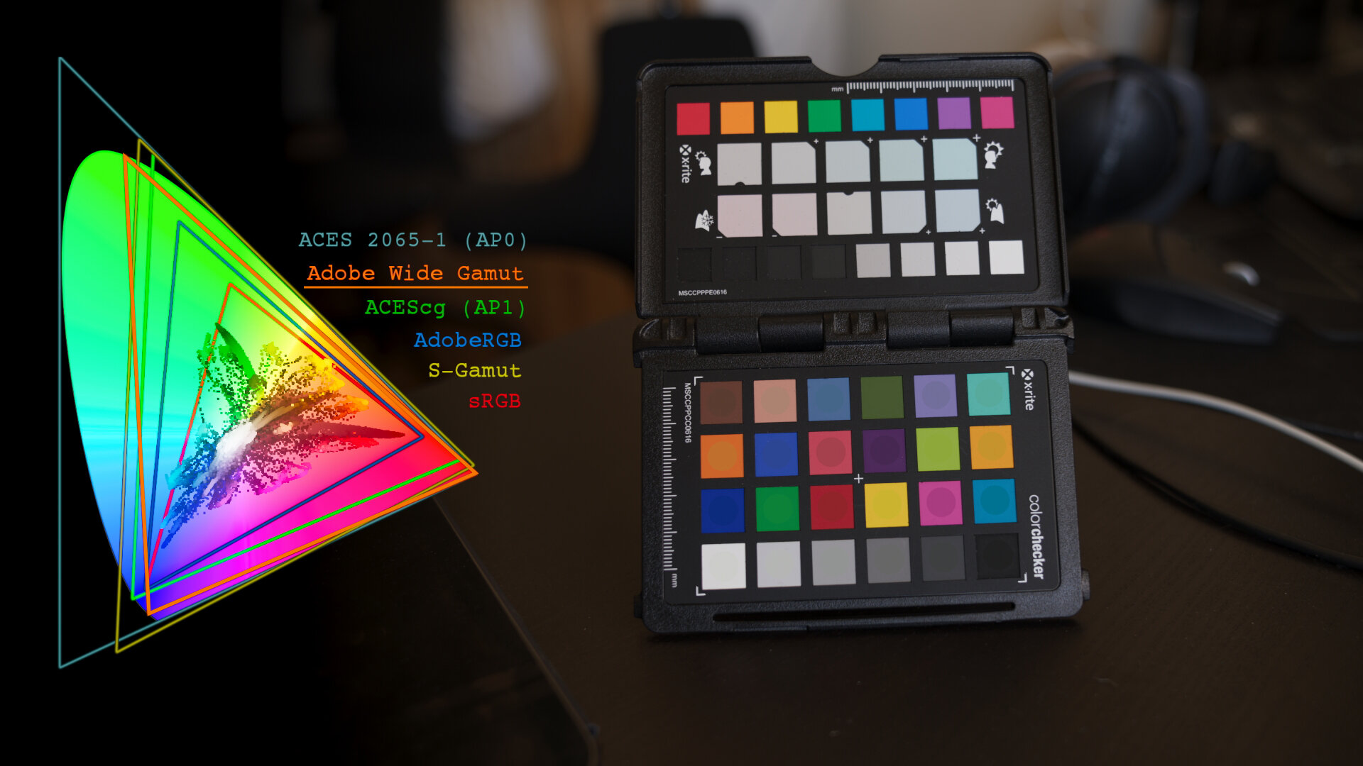
The HDRIs themselves are viewed through a Rec.709 view transform, to help me compare the color shifts.
You’ll probably spot several differences between these HDRIs. The colors shift around the diagram between color spaces, which isn’t what I would expect working with RAW material. But, this can be due to a myriad of reasons, like inaccuracies in the color profiles (ICC) used during development and also the fact that this isn’t a very scientific test, due to my limited understanding of color science and the limits of my gear.
But in the end, I wanted to get to the result that to me looked “correct” and this test was very helpful. It’s not an easy pick and I would definitely benefit from doing more extensive testing to come up with a more clear-cut answer. But I liked the way certain wide-gamut color spaces worked for me and that gives me confidence when deciding how to develop my RAWs to get the most accurate HDRIs possible.
Let’s leave colors for now and look at the next wonderful subject, backplates!
Part 3: HDR Backplates
The backplates provided with JorgenHDRIs are not your typical backplates. I don’t offer a bunch of JPGs, or better yet, 16bit TIFFs developed from RAWs. Instead I have decided to only sell HDR backplates.
I never managed to get my renders looking good with LDR backplates like JPGs or TIFFs without having to do a ton of work in post to individually match the tone of the render to the backplate, without the possibility to make changes to the overall exposure, since this would mean the backplate wouldn’t hold up.
Let’s take a look at how an LDR backplate handles changes in exposure. Go ahead and drag the blue handle across the render to underexpose by 5 EVs:
Now let’s replace that with a proper HDR backplate, calibrated to match the HDRI. Notice this time how the backplate behaves identically to the HDRI reflected in the chrome sphere and automatically looks more realistic!
I’m not saying HDR backplates is necessary to achieve photoreal renders. However, I’m claiming that you can’t get photoreal renders right out of the renderer without a certain amount of manual tonemapping on the CG elements and backplate separately, in order to make them match. Providing HDR backplates already matched to the HDRI removes all of this work for the user and let’s them focus solely on the artistic aspect, like a photographer seeing their models through a real camera. If you haven’t had a chance to try out HDR backplate rendering yet, I highly recommend considering this instead of your usual 8/16bit JPGs and TIFFs. You’ll be amazed at how much easier it is getting a photoreal render quickly, without needing years of specialized retouching experience.
Part 4: "Tonemapping"
In all renders shown in my article and showcasing my HDRI products has a consistent look to them. They aren’t color graded to achieve a certain aesthetic, but has a neutral, filmic tonemapping applied to them for an overall neutral and pleasing image.
Tonemapping is the process of transforming a piece of footage from scene-referred to display-referred RGB values. Real world light behaves linearily, but our vision isn’t working that way. We’re more sensitive to dark areas than bright, and this is represented through a transfer function (gamma curve) in a given color space. The most common color space, sRGB (developed in 1996), has a transfer function roughly (but not exactly) that of gamma 2.2. To simplify, this means shadows are lifted to create a more pleasing image.
sRGB is has been the most common way to transform scene-referred data to a display-referred image ever since it was developed, but other solutions has grown in popularity this last decade, like the Filmic tonemapper.
Let’s take a look at how a linear render is tonemapped first using the sRGB transfer function, followed by a Filmic LUT, then manual highlight compression, and finally, the ACES view transform:
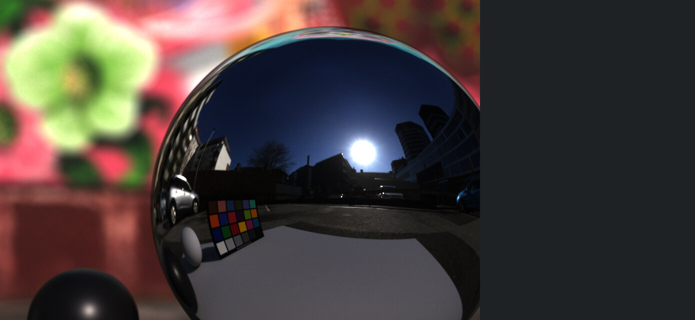
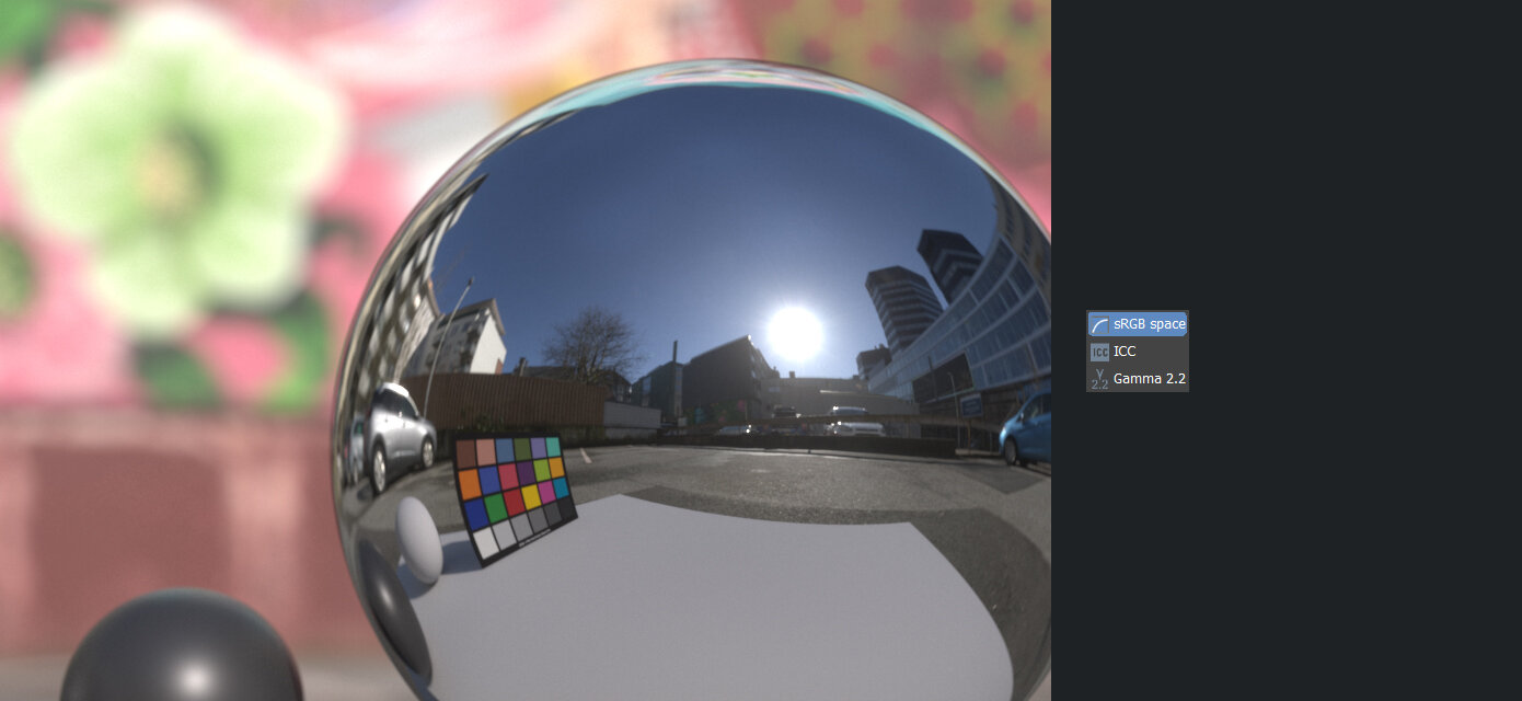

As shown in the examples above, sRGB (option 1) doesn’t do a good job at tonemapping a linear render. It lacks contrast in the dark areas and clips any bright areas in an unrealistic way. It’s the first thing to change when you’re after a more photoreal result.

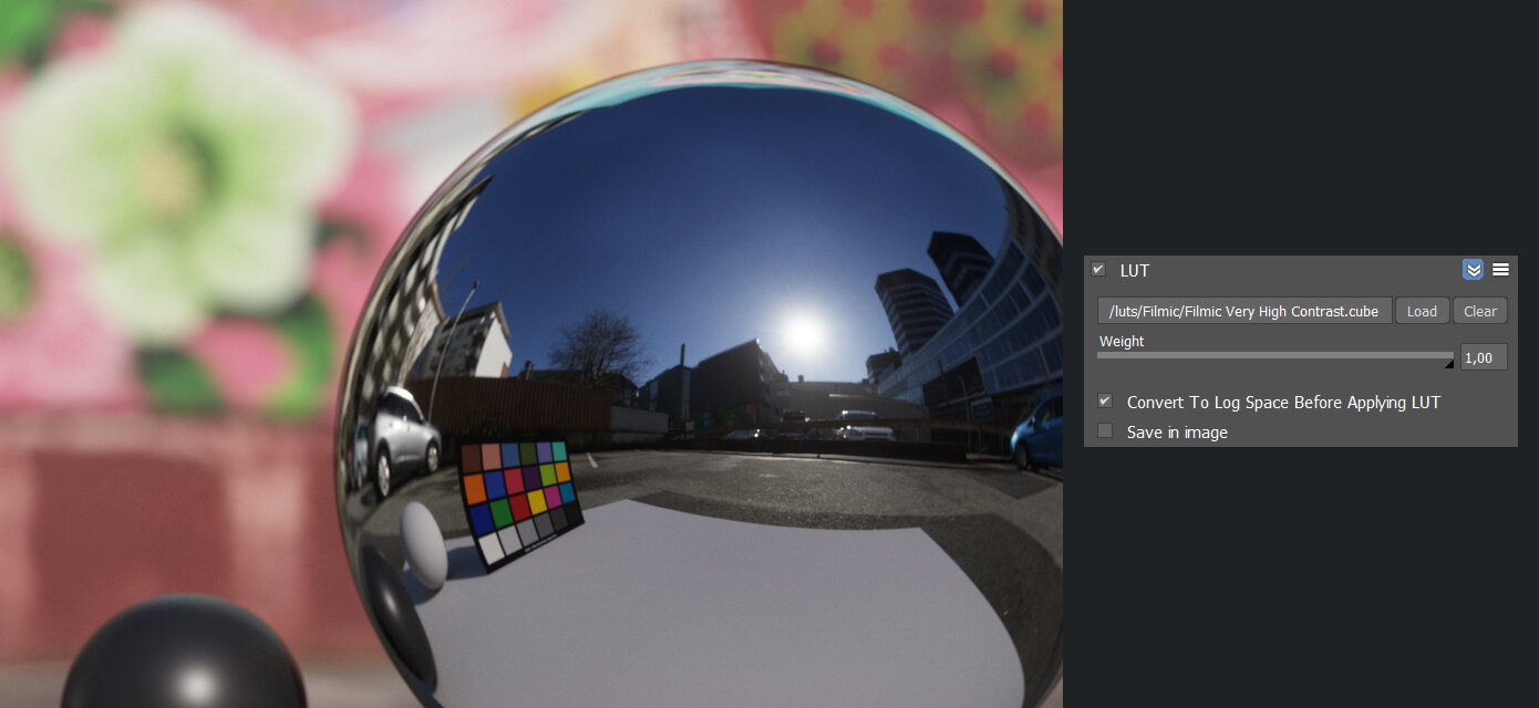
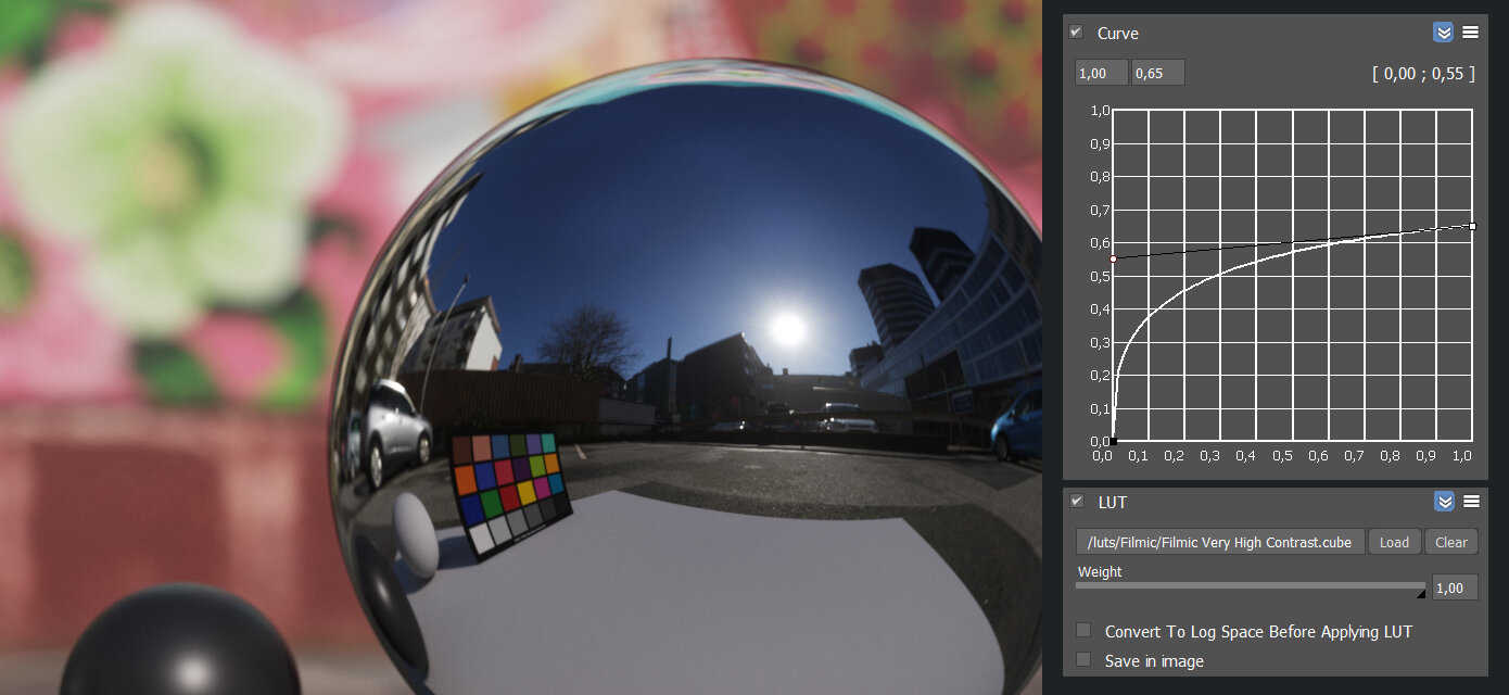
Option 2: A Filmic LUT applied on a log image looks like this. Notice the low contrast input (histogram) with a spike at the very right (the sun). The LUT simply applies a “filmic” curve to bring back contrast without clipping any of the shadows or highlights.
A very popular way to fix the issues of the sRGB curve, is using Filmic LUTs (option 2a), which applies a different curve to the linear render to add more contrast and recover the clipped highlights. However, this requires the linear render be converted to log first, to compress all the RGB values into a low dynamic range before the LUT is applied, since LUTs don’t like linear data.
If a renderer doesn’t support a lin2log-conversion, Filmic LUTs won’t be able to recover any of the clipped values. A workaround is to use a custom curve in the Frame Buffer (option 2b) to manually convert from linear to log. The method shown in this example is done by eye to match the previous result and is therefore not as accurate. But it gets the job done and it means you’re then free to use a Filmic LUT.
If LUTs aren’t preferred (or available) as a way to tonemap your render, you can instead use highlight-compression/recovery/shoulder, if your renderer supports it (option 3). In this example I dragged the highlight compression slider all the way to the left and added a bit of contrast, to closely mimick the Filmic curve.
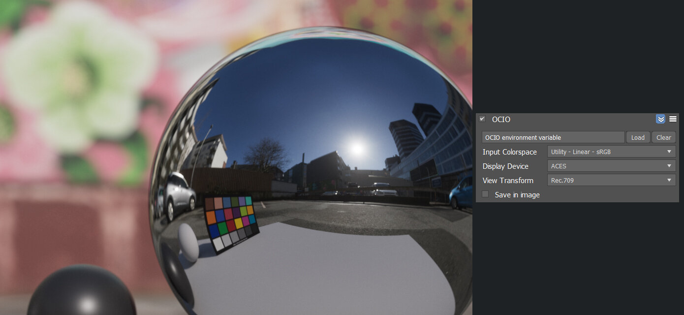
The final option, and undoubtedly the most requested part of this article, is the ACES View Transform (option 4). ACES is first and foremost a complete color management system meant for archival purposes, having standard and future-proof color spaces and as a way for camera manufacturers to provide a neutral starting point for reading scene-referred data. But in addition, the ACES team has also provided a filmic curve in their Reference Rendering Transform (RRT), applied automatically before the Output Display Transform (ODT). This gives a lot of contrast and a strong highlight rolloff (some say too strong), which is very close to what the “Filmic Very High Contrast” blender LUT used in the previous examples has. The last example shown here wasn’t rendered in an ACES workflow, since that would mean using the ACEScg (AP1) color space for any assets as well. Instead, since I just wanted to show the RRT/ODT tonemapping, I decided to stick with Linear sRGB as input (meaning all my textures and HDRI were in the sRGB color space) and just used ACES as a tonemapping solution. But as you’ll see scrolling through the examples, the result is nearly identical to using a simple log + LUT solution, which means if you’re just interested in using ACES for the tonemapping, you might be better of sticking with a LUT (option 2) or manual highlight compression (option 3).


Imprtant! If you’re a Corona-user and can’t convert to log nor adjust the curves like I’ve shown here, there are two alternative ways you can achieve the same filmic look. One is using the tonemapper parameters like I showed in option 3, the other is to replicate a log curve using the tonemapper parameters and then adding the Filmic LUT.
(Note: This doesn’t let you create the same kind of log image that lin2log or a curve adjustment would, so I recommend using a lower contrast LUT for this.)